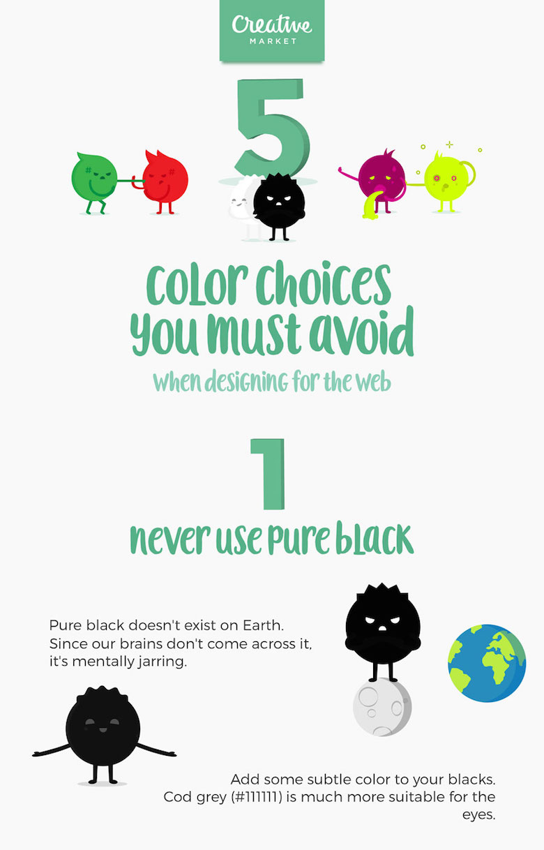
5 Color Choices You Must Avoid When Designing For The Web

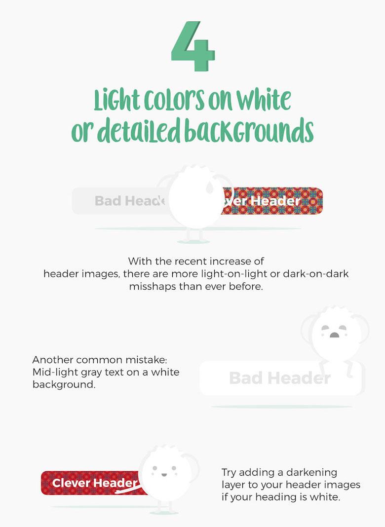
When it comes to web design, colors play a vital role in increasing conversions, reducing bounce rate and ensuring a smooth user experience. We often see websites compromising on readability by using light-colored text on light backgrounds.
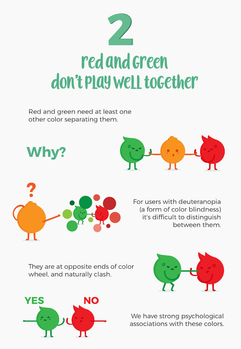
Also, it’s never ok to use red and green in excess, even if you’re making a Christmas-themed website.
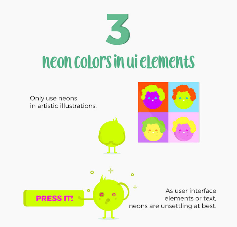
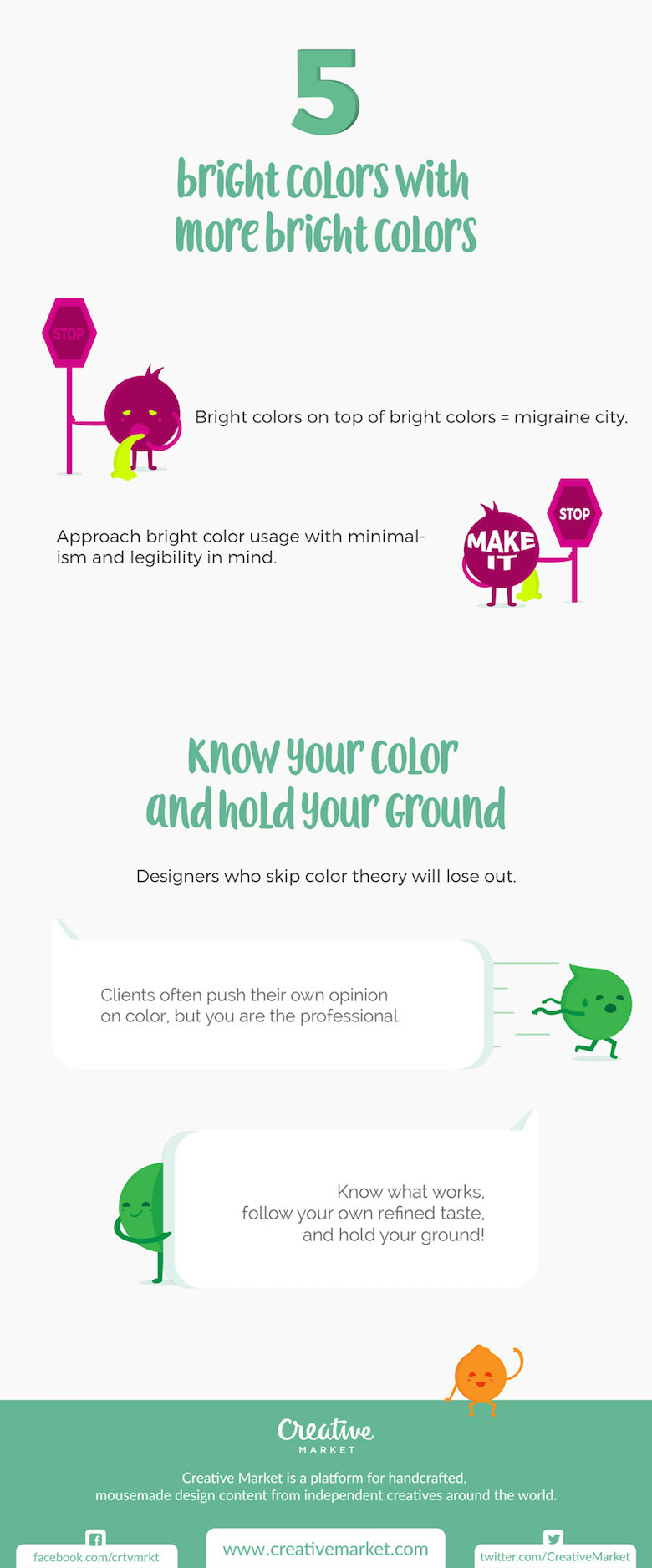
Here’s a handy infographic from Creative Market that lists five color choices that you should avoid when designing for the web.
Have something to add to this graphic? Share this post with a designer friend and voice your views in the comments below. Check out Creative Market for high quality design assets like icons, fonts, vectors, themes and more.